

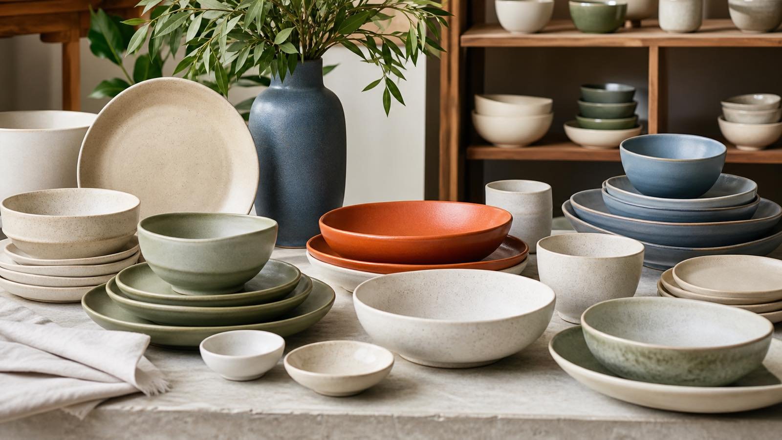
Trend-led dinnerware can refresh a retail assortment or restaurant presentation, but visual novelty alone does not make a sound order. Wholesale ceramic dinnerware trends should be translated into customer fit, usable shapes, repeatable quality, and workable quantities. This guide reviews important color, form, and style directions and gives importers, distributors, and hospitality buyers a practical method for building ranges without chasing every passing look.
Read Trends as Directions Not Sales Guarantees
Trend reports are useful signals, not demand forecasts for every market. Messe Frankfurt’s official Ambiente Trends 26+ identifies three broad style worlds: expressive and imaginative design, airy lightness, and enduring versatility. Its themes include playful colors, expressive forms, pastel and shimmering effects, clean forms, lasting materials, and geometric structures.
For tableware buyers, the value lies in converting these broad directions into testable assortment ideas. A bold concept may become one accent plate rather than an entire dinner set. An airy direction may translate into pale glazes and refined profiles. A durable, timeless direction may support clean silhouettes and versatile neutral colors.
Before adopting a trend, ask:
- Does it suit the target customer and sales channel?
- Can it coordinate with products the customer already owns?
- Does the finish remain practical after utensil and washing trials?
- Are the key shapes available in commercially useful quantities?
- Can product photography accurately show color and variation?
- Is the idea broad enough to survive beyond one short campaign?
Treat the answer as a buying hypothesis, then validate it with samples, merchandising mockups, and customer feedback.
Separate observation from prediction in internal planning. Record where a direction came from, when it was reviewed, and which customer problem it may solve. Then set a small number of approval criteria and a review date. This keeps the team focused on evidence from its own channel instead of treating broad international inspiration as guaranteed local demand.
Ceramic Tableware Color Directions
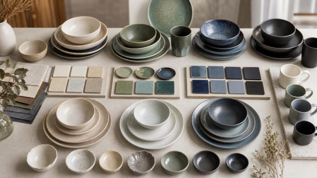
Color can attract attention quickly, yet it also creates the greatest risk of an unbalanced range. A practical color plan separates core tones, supporting colors, and limited accents.
Warm Neutrals and Earth Influences
Warm white, sand, oatmeal, clay, taupe, and muted brown can support natural, relaxed presentations. These tones coordinate with wood, linen, stone, and many food colors. They are especially useful when a buyer wants more warmth than bright white without committing to a strong seasonal hue.
Neutral does not mean identical. Compare samples in daylight and store or restaurant lighting. A warm white cup may look mismatched beside a cool white plate. Reactive or speckled neutral glazes also need an approved range showing acceptable light and dark variation.
Muted Greens Blues and Pastels
Sage, olive, mineral blue, dusty blue, pale pink, and soft yellow can provide gentle color while remaining easy to combine. Buyers can use one color across all shapes, alternate colors by item, or create a controlled mix-and-match story.
Test colored pieces with representative foods and table textiles. Dark glazes may make utensil transfer more visible, while very pale colors can shift under warm lighting. The ceramic glaze types guide explains why finish and color should be evaluated together.
Expressive Accents and Contrast
Stronger color works well when its role is clear. Cobalt, coral, deep green, or black may become a charger, serving platter, mug, or patterned accent plate. Concentrating color in selected items can reduce inventory fragmentation and make replacement planning easier.
| Color role | Assortment purpose | Suitable items | Buyer check |
| Core neutral | Broad coordination | Dinner plates, bowls, cups | White tone and continuity |
| Supporting color | Range personality | Side plates, mugs, bowls | Cross-shape color match |
| Accent color | Visual focus | Platters, chargers, feature plates | Merchandising balance |
| Mixed palette | Flexible display | Small plates and drinkware | Ratio and reorder plan |
Shape Trends That Affect Usability
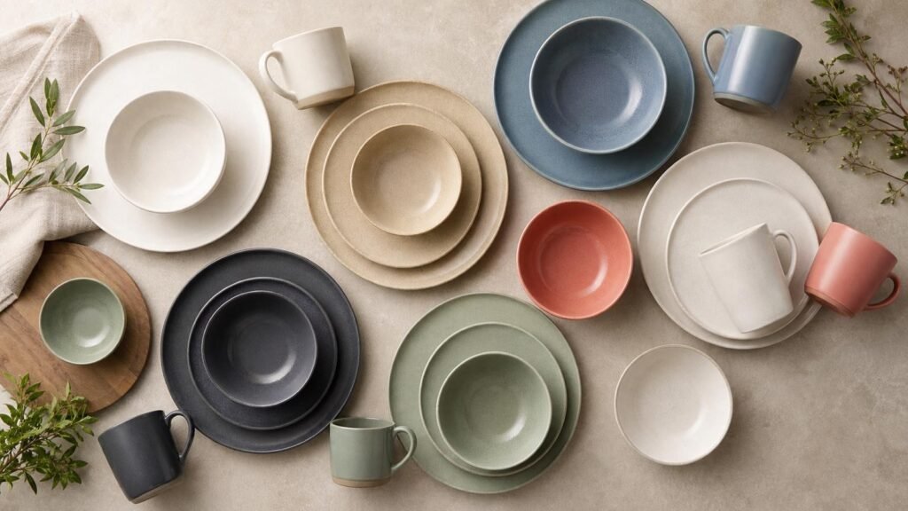
Shape changes far more than appearance. It affects usable capacity, stack height, carton efficiency, table footprint, rack fit, and edge exposure.
Organic and softly irregular forms create an individual, relaxed character. Their asymmetry can suit lifestyle retail and casual restaurants, but buyers must define how dimensions are measured and what degree of outline variation is acceptable. Photograph representative limits rather than approving one piece.
Coupe plates and low bowls remain versatile because their open surface supports modern plating and casual meals. Wide-rim plates create a formal frame but can reduce the usable center. Deep plates bridge bowls and dinner plates, supporting pasta, grains, sauces, and composed dishes. Test portion size rather than relying on the product name.
Geometric forms, fluting, relief, and pedestal details can build a distinctive collection. They also introduce contact points in stacking and packing. Inspect corners, raised textures, feet, and how one piece rests against another. Decorative relief should not make cleaning unnecessarily difficult in the intended application.
Use a specification sheet for every shape:
- record maximum diameter or length and width;
- measure height, usable area, and capacity where relevant;
- record piece weight and stack height;
- test shelves, trays, tables, and dishwasher racks;
- review the inner pack and export carton;
- retain approved samples and photographs.
Browse ready stock ceramic tableware as complete families and confirm that plates, bowls, mugs, cups, and serving pieces share a coherent scale and design language.
Style Stories Buyers Can Merchandise
A successful range tells a clear story at shelf, table, or online-listing level. Four practical stories can cover many current directions without requiring an excessive number of items.
Minimal contemporary ranges use restrained forms, limited colors, and controlled details. Their commercial strength comes from versatility, but proportions and finish must carry the design. Natural tactile ranges combine warm tones, speckles, reactive effects, or soft irregularity. Buyers should communicate expected variation accurately.
Expressive mix-and-match collections use pattern, color, or contrasting shapes. The buying plan should define the ratio of quieter core items to statement pieces. If every item competes for attention, the display can lose cohesion. Classic refreshed ranges retain familiar shapes while adding a new rim color, relief, or updated glaze.
Build a physical or digital range board showing every item at relative scale. Add target price, carton quantity, available quantity, and intended role. Remove any item that lacks a clear function or repeats another item too closely.
Build and Test a Trend Led Wholesale Range
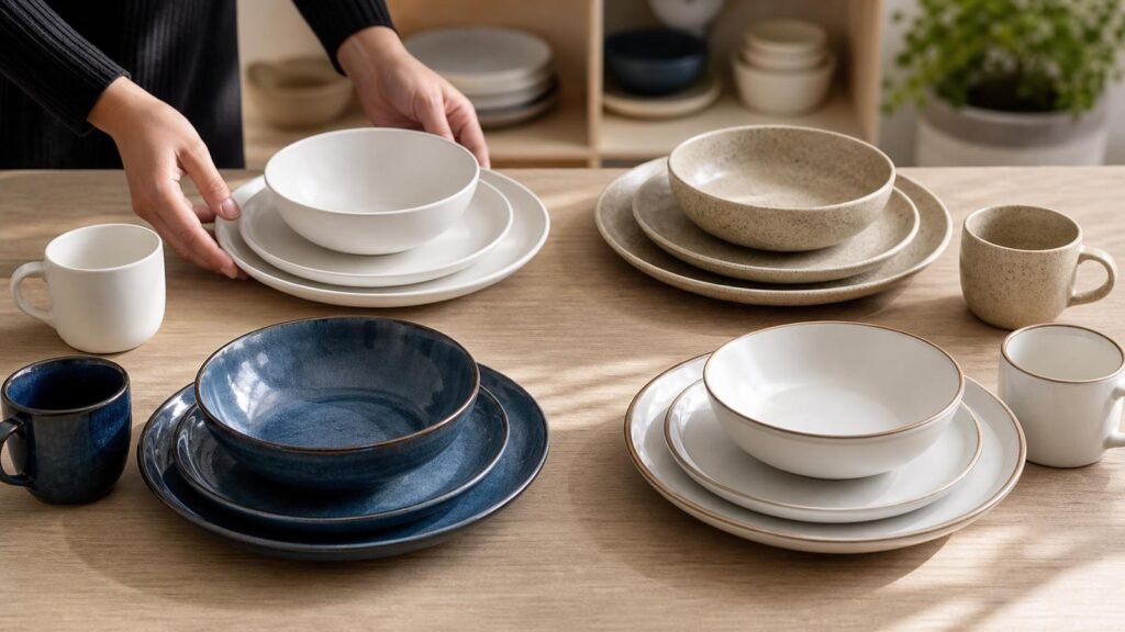
Start with the customer brief: market, channel, target price band, core material, preferred colors, required shapes, order quantity, packing, and timing. Then create a narrow first selection. A range of six coordinated items that covers clear eating occasions can be more commercial than twenty unrelated designs.
Evaluate samples in a repeatable sequence. Confirm item codes and specifications, compare color under consistent lighting, inspect glaze and decoration, test stability and stacking, serve representative food, and run the intended cleaning workflow. For hospitality, test trays, racks, shelving, and replacement handling. For e-commerce, test photography and write dimensions clearly.
Plan quantities by role. Core dinner plates and bowls may need deeper stock than accent pieces. Convert quantities into complete place settings, retail sets, or table presentations to reveal imbalances. Confirm pack multiples before finalizing the assortment.
Ready-stock purchasing can help buyers access varied designs and react faster, but exact availability can change. Define approved alternatives using material, shape, size, finish, color family, and price position. An alternative should preserve the range story, not merely fill carton space.
Normalize quotations by currency, trade term, named place, price unit, packing included, payment terms, validity, availability, and preparation schedule. Record carton dimensions and gross weights so the visual decision connects to landed cost.
Conclusion
Wholesale ceramic dinnerware trends are most useful when buyers turn broad color, shape, and style signals into a disciplined assortment. Use neutrals for coordination, accents for focus, and forms that pass real handling and service tests. Approve representative samples, balance quantities by product role, and prepare alternatives before ordering. To review designs suited to your channel, request current dinnerware options with your market, required items, and target quantities.
FAQ
Warm white, soft neutrals, and restrained natural tones usually coordinate with a wide range of interiors and food presentations, but no color is universal. Test samples under the target store or restaurant lighting and beside existing products. Buyers can add stronger colors through mugs, side plates, or serving pieces while keeping high-volume core items easier to coordinate.
They can be practical when dimensions, variation, stacking, and packing are clearly controlled. Measure maximum length and width, test the actual shelf and dishwasher rack, and approve several representative pieces. Product photos should show the intended outline character. For hospitality, confirm that irregular edges do not slow plating, carrying, clearing, or storage.
Update according to customer response, inventory position, and channel calendar rather than a fixed universal schedule. Keep proven core shapes while testing new colors or accents in smaller, controlled quantities. Review sell-through data where available, record customer feedback, and avoid replacing a coherent range simply because a new visual direction appears in a trend report.