

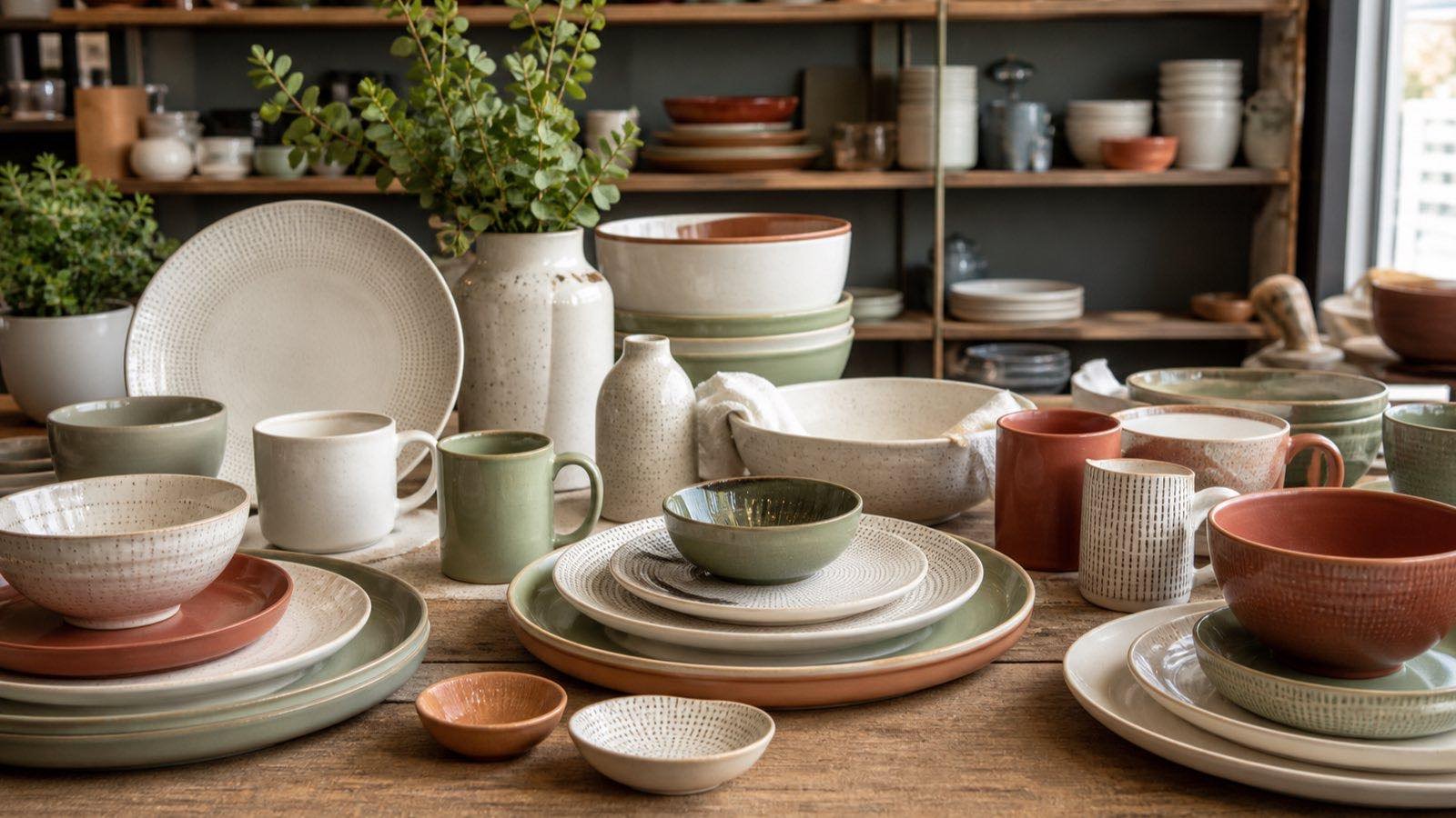
Mixing tableware can create a distinctive retail range, but variety without structure produces slow SKUs and confusing displays. A ceramic tableware mix and match plan connects color, shape, material, price, and item function so customers can build settings confidently. This guide shows retailers how to create coherent combinations, set quantities, validate samples, and keep the assortment commercially manageable.
Start with a Retail Customer and Assortment Story
Define who will buy the range, where it will be sold, and what problem the assortment solves. A compact urban store may need a small coordinated capsule, while a large homeware retailer can support several color families and serving extensions. Ecommerce needs precise dimensions and clear photography; independent stores may benefit from curated combinations and flexible display units.
Write the assortment story in one sentence. Examples include calm everyday neutrals with textured accents, colorful casual dining with shared shapes, or hospitality-inspired white forms with one decorative layer. The statement is a decision filter, not marketing decoration. If a proposed SKU does not strengthen the story or serve a missing function, it should not enter the initial buy.
Record channel, target customer, price band, planned selling period, store count, display capacity, and review date. Separate observed customer evidence from the buyer’s personal preference. Use recent sales, store audits, search behavior, staff feedback, and controlled tests to form a hypothesis, then measure actual results by SKU.
Choose the Rules for Ceramic Tableware Mix and Match
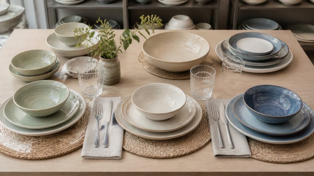
Successful mixing needs at least one repeated design element. The connection may be a common color family, shared rim profile, repeated glaze texture, consistent material impression, coordinated decoration scale, or matching price position. One anchor can create unity while another element varies.
Begin with core forms: dinner plate, side plate, bowl, mug or cup, and serving piece if customers expect one. Decide which forms must match exactly and which can act as accents. Many retail programs work better when the high-use pieces are visually calm and the expressive pattern appears on smaller plates, bowls, or serving pieces. This supports customer choice without making every place setting visually busy.
Coordinate Color Deliberately
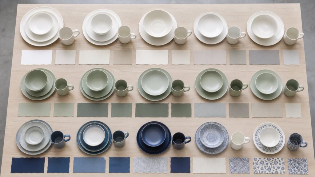
Compare samples under the lighting used in the store and in neutral daylight. Similar whites can look unrelated when one is warm and another is cool. Reactive glazes may show intended variation, so define an acceptable visual range rather than approving one exact patch of color. Use the existing ceramic tableware color selection guidance as a planning reference and validate the chosen models together.
Use a simple color structure: one anchor neutral, one or two supporting colors, and a controlled accent. Repeat the anchor across several functional items. If multiple decorations are used, keep their scale, line weight, or palette related. Photograph every approved combination as a full place setting and as individual retail groups.
Balance Shape and Texture
Round and coupe shapes usually combine more easily than highly specific geometric profiles, but a shared foot, rim, or glaze can connect different silhouettes. Check stack behavior and physical scale. A deep bowl beside a delicate low plate may feel unbalanced even when their colors match. Measure height, usable area, rim width, capacity, and stack footprint.
Texture should support use. Embossing, fluting, matte surfaces, and reactive finishes add interest, yet they also affect cleaning, cutlery feel, stacking contact, photography, and customer expectations. Test the actual pieces rather than inferring performance from a catalogue image.
| Mixing method | Anchor |
| Tonal range | One color family |
| Neutral and accent | White beige or gray |
| Shared shape | Repeated silhouette |
| Shared decoration | Consistent motif scale |
| Material story | Similar visual weight |
Build SKU Roles and Buying Depth
Assign every item a commercial role. Core SKUs provide the dependable base, coordinating SKUs complete a place setting, accent SKUs create display interest, and test SKUs gather evidence. This prevents the range from giving equal space and cash to products with different expected demand.
Create a matrix with item function on one axis and color or design family on the other. Mark essential combinations first. A retailer rarely needs every form in every color. Selective gaps can make the offer easier to understand and reduce fragmented inventory. For example, carry dinner plates in two anchors, bowls in both anchors plus one accent, and serving pieces only in the most versatile finish.
Calculate depth from forecast demand, pack multiples, store allocation, safety policy, lead time, and review period. Do not distribute quantities equally merely because the assortment looks balanced on paper. High-frequency plates and bowls may need more units than serving pieces. A strong visual accent may need broad display presence but shallow back stock.
Check price architecture at both item and setting level. Customers should understand the progression between entry, main, and elevated options. Calculate the retail value of a practical place setting and a common customer basket, not only the price of one plate. Mixed ranges become difficult to sell when coordinated pieces sit in conflicting price positions.
| SKU role | Purpose |
| Core | Carries everyday volume |
| Coordinator | Completes common settings |
| Accent | Adds choice and display energy |
| Test | Measures unfamiliar demand |
Approve Samples as Complete Place Settings
Individual samples can look attractive while failing as a group. Assemble the proposed dinner plate, side plate, bowl, cup or mug, and serving piece on a realistic table and retail shelf. Review scale, color temperature, visual weight, usable area, and handling. Photograph the combinations from above, at customer eye level, and as they will appear online.
Inspect several pieces per model for stability, rim and foot finishing, glaze coverage, decoration placement, dimensions, weight, and normal appearance variation. Confirm that stacked pieces do not create undesirable surface contact. For cups and saucers, verify physical fit and visual proportion. For retail sets, test the final box, separators, labels, and customer-facing piece count.
Create an approval sheet for each model and one for each intended combination. Model approval answers whether the item is acceptable; combination approval answers whether it belongs in the range. Record substitutions that preserve the story in case current quantities change before confirmation.
Compliance requirements depend on destination, material, decoration, intended use, and labeling. Confirm current obligations with qualified local advisers and request evidence linked to the exact product scope. Avoid treating a general supplier statement as proof for every finish or market.
The ready stock ceramic tableware range can offer flexible design choices, but present availability should be checked by exact model and quantity. Retain dated lists and confirm the final allocation only after samples and commercial terms are approved.
Plan Merchandising Packing and Replenishment
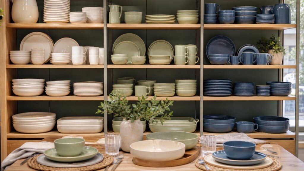
Merchandise combinations rather than isolated shelves of plates. Show at least one complete setting and provide a simple way for customers to identify compatible pieces. Use consistent model names, color names, dimensions, and care information across shelf labels, ecommerce pages, packing, and warehouse records. Avoid claiming an exact color match when normal glaze variation is part of the design.
Photography should include a clear individual product view, a coordinated group, and scale information. Keep lighting and editing consistent so colors remain comparable. For ecommerce, list diameter, height, capacity where relevant, weight, piece count, material, finish, and variation notes. Accurate content reduces avoidable returns and helps customers extend their settings later.
Packing and warehouse controls must preserve the mix. Confirm pieces per inner pack and carton, labels, barcodes, carton marks, and model traceability. When several similar colors are ordered, use unambiguous codes rather than relying on names such as blue or cream. Calculate freight from final carton dimensions and weights by SKU.
Set a review after launch. Track sell-through, gross margin, return reason, damage, attachment between coordinated pieces, stockouts, customer questions, and display performance. Compare results by store or channel where possible. An accent that generates attention but few sales may still support the core range, but that role should be evaluated consciously.
Replenishment should protect the assortment story. Reconfirm current availability, cost, carton multiples, and timing. If a model is unavailable, choose a substitution through the same color, shape, price, and sample checks instead of introducing a visually convenient but commercially inconsistent item.
Conclusion
Ceramic tableware mix and match succeeds when variety follows a visible rule and every SKU has a commercial role. Anchor the range with repeatable forms and colors, control experimental depth, approve full settings, and measure attachment as well as individual sales. Explore the ready stock ceramic tableware range, or request current assortment options with your channel, color direction, required items, quantities, and target timing.
FAQ
There is no universal number. Start with the display capacity, customer evidence, item count, pack multiples, and cash budget. One anchor neutral with one or two supporting colors and a controlled accent is often easier to communicate than every form in many colors. Test unfamiliar colors in limited depth, then increase quantities only when SKU-level sales and attachment support the decision.
Not necessarily, but the combination should meet the same intended use and present a coherent visual and price story. Compare color temperature, weight, rim profile, glaze behavior, care requirements, and compliance scope. Tell customers clearly when materials or care instructions differ. Approve the physical setting and packaging rather than assuming pieces coordinate because their catalogue colors appear similar.
Review sell-through, attachment, returns, stockouts, display role, and remaining inventory by SKU. Reorder core pieces according to actual demand and maintain enough coordinating items to keep the range useful. Reconfirm current quantities, price, carton data, and timing before approval. If substitution is needed, test it against the original color, shape, scale, quality, and price rules.