

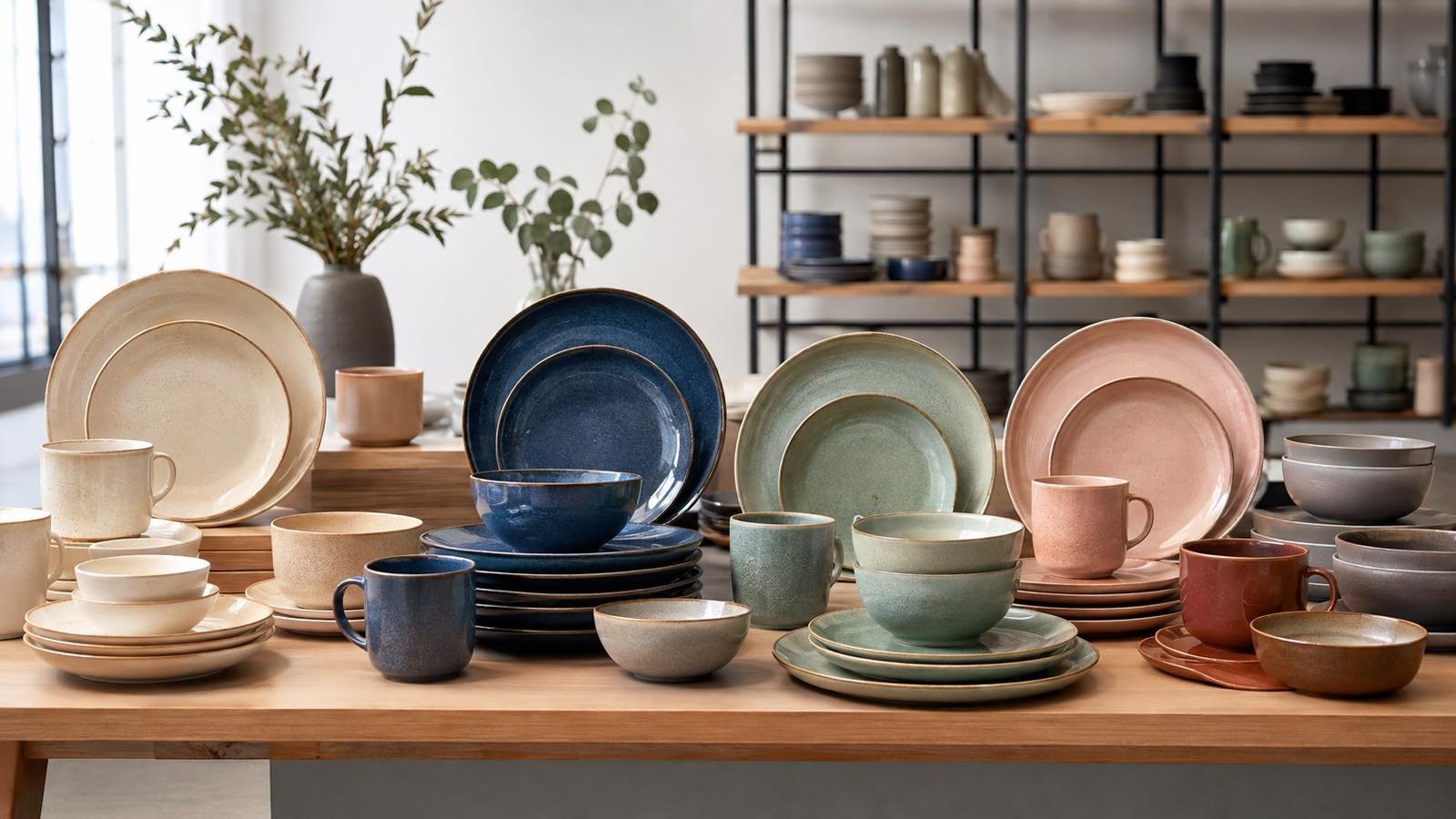
Color can attract a shopper from across the store, but a retail ceramic range succeeds only when the palette also supports coordination, inventory control, photography, and repeat purchasing. Ceramic tableware color selection should connect each shade to a target customer, eating occasion, price position, and product role. This guide shows retailers how to build balanced palettes, approve glaze color, plan quantities, and reduce risk when availability changes.
Start with the Customer and Merchandising Context
Define the customer before choosing colors. A minimalist homewares customer may prefer warm whites, sand, gray, and restrained texture. A family-focused range may need versatile colors that combine easily and hide ordinary marks. A trend-led customer may respond to stronger seasonal accents, while hospitality-oriented retail customers may value replacement-friendly neutrals. Record the customer segment, room style, eating occasions, price band, material, finish, sales channel, and launch window.
Study where the products will appear. Colors behave differently on open shelving, in printed packaging, under marketplace thumbnails, and in lifestyle photography. Note shelf materials, background color, store lighting, online image style, and neighboring categories such as textiles or glassware. A muted green that looks distinctive on white may disappear against a dark shelf. A glossy black plate can create drama but also show reflections and surface marks in photography.
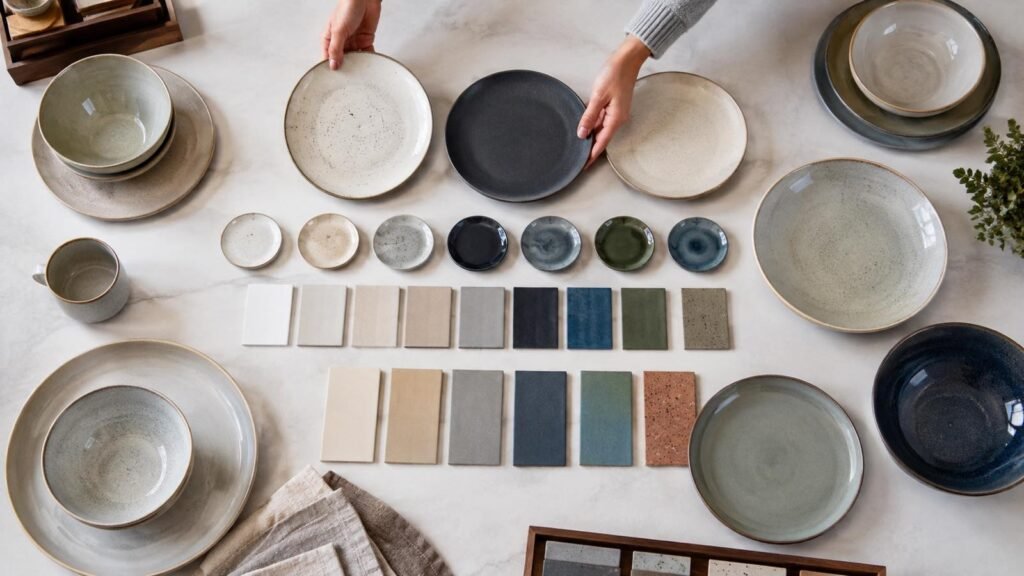
Use evidence available to your business: past sales, search terms, saved products, sample feedback, returns, customer questions, regional preferences, and competitor shelf observations. Treat social-media attention as a signal, not guaranteed demand. A palette should solve the retailer’s commercial brief rather than copy a trend image.
Define a Core Supporting and Accent Structure
Assign every color a role. Core colors carry the largest quantity and longest intended selling period. Supporting colors broaden coordination and may share most shapes with the core. Accent colors create visual interest in a smaller number of pieces or limited quantities. This structure prevents five attractive colors from receiving equal investment without equal demand.
A practical range might use warm white as the core, muted blue and natural green as supporting colors, and a terracotta or deep berry accent in bowls, mugs, or serving pieces. The exact palette depends on the customer and market. Record which shapes appear in each color, how products can be mixed, and whether the range is sold individually or as sets.
Build Color Families That Customers Can Combine
Coordination does not require every item to match exactly. Colors can connect through shared undertone, glaze character, rim treatment, shape language, or decoration. Warm colors generally coordinate more naturally with other warm undertones; cool grays and blue-whites may sit awkwardly beside cream. Compare all components together, including plates, bowls, mugs, serving ware, textiles, cutlery, and packaging.
Create a physical range board from representative finished samples. Arrange complete place settings and mixed combinations, then photograph them under controlled conditions. Review the palette from close range and from the distance of a retail aisle. A color may work as a small mug accent but dominate when applied to a large dinner plate.
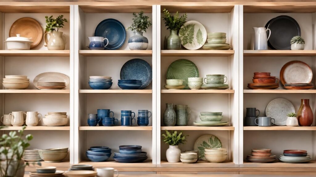
Think in terms of food presentation as well. Neutral surfaces are flexible, while saturated colors can create strong contrast with some foods and compete with others. Broad rims expose more glaze area; deep bowls create shadows that make interior color appear darker. Speckled, reactive, or gradient finishes add character but also increase piece-to-piece variation.
Use Texture and Finish as Part of Color
Gloss, satin, matte, transparent, opaque, reactive, and speckled surfaces change how a color is perceived. Gloss reflects store lights and can appear brighter. Matte finishes scatter light and may look softer, but buyers should review marking, cleaning, and tactile expectations on the actual product. A transparent glaze allows the body and decoration beneath it to influence the final appearance.
Do not approve a glaze from a digital color chip. Ceramic color develops through the interaction of body, glaze composition, application, firing, shape, and thickness. Approve representative finished pieces and define an acceptable range where natural variation is part of the design. State that variation accurately in product pages and packaging to reduce avoidable returns.
| Palette role | Commercial purpose | Typical quantity approach | Review question |
| Core | Long-running coordination and volume | Greatest depth across key shapes | Can it work across seasons and settings |
| Supporting | Extends choice without duplicating everything | Medium depth in selected shapes | Does it coordinate clearly with the core |
| Accent | Creates display focus and freshness | Smaller focused quantity | Which items show the color effectively |
| Seasonal test | Measures demand with limited exposure | Controlled initial quantity | What evidence will trigger a repeat |
Approve Color Under Realistic Lighting
Lighting can change color dramatically. Daylight varies by time and weather; retail LEDs differ in color temperature and rendering quality; restaurant light may be warm and dim. Review samples in a neutral controlled setting, then in the intended store environment. For ecommerce, create a consistent photography workflow with stable lighting, white balance, background, camera profile, and editing rules.
Compare several pieces from the proposed supply. Place them in the same orientation and examine the center, rim, foot, textured areas, and pooled glaze. Rotate pieces to reveal gloss and surface variation. If the design includes a reactive glaze, group samples into the acceptable visual range and identify any appearance that falls outside it.
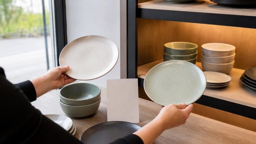
Keep an approved physical sample or controlled reference set. Screens cannot guarantee accurate color because devices and settings vary. Photographs remain useful for records when captured consistently, but the purchase order should reference the approved sample and agreed variation language.
Align Online Images with the Received Product
Overedited product images may increase initial clicks but also raise returns and customer distrust. Use a neutral master image that shows body tone and finish honestly, then add lifestyle images for context. Include close views where speckles, reactive effects, or texture matter. Show mixed-color sets exactly as sold and list included colors in the product data.
Test thumbnail legibility. Subtle differences between two beige shades may disappear on a phone screen, making duplicate listings hard to understand. If colors need lengthy explanations to distinguish online, consider whether both deserve separate inventory. Use stable, descriptive color names and avoid changing names between packaging, catalog, and website.
Plan Quantities by Color and Shape
Start with selling units, not equal piece counts. A four-place retail set, open-stock display, and mix-and-match promotion each create different ratios. Identify core shapes—often dinner plates, side plates, bowls, and mugs—then decide which supporting or accent colors deserve each shape. Serving pieces can introduce color without forcing customers to commit to a full setting.
Weight initial quantities using sales evidence, customer commitments, channel reach, shelf space, carton multiples, available stock, and cash limits. Use a smaller test for an unproven accent and define the evidence required for a repeat, such as sell-through over an agreed period, reorder requests, or attachment to the core range. Avoid interpreting a fast sale from very low initial stock as complete proof of long-term demand.
Review ceramic tableware collections as mixable families where appropriate, but confirm current availability for every color and shape. Ready stock can support flexible purchasing, though availability is a dated fact. Ask whether quantities can be reserved and define alternatives by function, material, undertone, finish, dimensions, price position, and compatibility with the remaining range.
Prevent Unbalanced Mixed Color Sets
For mixed-color cartons or sets, specify the ratio precisely. “Assorted colors” does not explain whether the mix is equal, fixed by carton, selected by the buyer, proposed by the supplier, or dependent on availability. Record color names, reference images or samples, quantity per color, packing sequence, and substitution rules.
Model what happens when one color sells faster. Can the retailer replenish that color alone, or will every repeat add slower colors? Can stores transfer units or create alternative sets? The supply and packing model should support the merchandising promise.
Compare Cost Packing and Reorder Risk
Color can influence cost through glaze, decoration, order quantity, setup, sorting, and packing. Normalize quotations by item, material, color or finish, dimensions, set contents, quantity, packing, price unit, trade term, named place, payment, validity, availability, and schedule. Add samples, inspection, freight, insurance, duties, taxes, destination handling, labeling, warehousing, financing, and expected loss.
Packing must protect glazed faces, rims, handles, and raised texture. Confirm inner quantities, dividers, sleeves, retail boxes, master-carton dimensions, gross weight, and pallet needs. Colored or matte surfaces may show rubbing differently from glossy white, so review packed samples and transport simulation where risk justifies it. Packaging windows and printed photography should represent color honestly.
Manage reorder expectations in product copy and internal systems. If a glaze naturally varies, make that clear. If a color is seasonal or quantities are limited, do not imply permanent continuity. Keep approved substitutes for important commercial roles, but assess the whole palette before replacing one shade. A technically similar blue can still disrupt the undertone or balance of the range.
Create a Repeatable Color Approval Process
Use one approval sheet for item code, material, body tone, glaze name, finish, decoration, dimensions, weight, packing, approved sample date, acceptable variation, available quantity, photography status, and customer-facing color name. Link images to the exact sample and revision. Ensure purchasing, quality, ecommerce, packaging, and stores use the same identifiers.
After launch, collect sell-through by color and shape, attachment rates, searches, sample feedback, returns, breakage, reviews, markdown activity, and reasons for customer rejection. Separate weak demand from poor photography, missing stock, inadequate display, or an unbalanced shape mix. Review the palette on a defined schedule and make controlled changes rather than rebuilding the range from isolated anecdotes.
A supplier enquiry should state the target customer, channel, core and accent strategy, required shapes, material, finish, color references, quantities, packing, delivery point, and timing. Ask for current availability, representative samples, expected variation, carton data, and quotation validity. Clear briefs allow faster and more useful shortlists.
Conclusion
Ceramic tableware color selection succeeds as an assortment decision, not a collection of favorite shades. Build a core, supporting, and accent structure; approve finished samples under realistic lighting; and plan quantities by color and shape. Document glaze variation, mixed ratios, packing, and alternatives before ordering. Browse our retail tableware buying resources or contact our wholesale team with your palette brief.
FAQ
There is no universal number. Start with one dependable core color, then add supporting and accent colors only when each has a clear customer, merchandising, or seasonal role. Consider shelf space, online clarity, carton multiples, and reorder flexibility. A focused palette with useful shape coverage is usually easier to explain and control than many near-duplicate colors with shallow inventory.
Review multiple finished samples under neutral and store lighting, then agree on an acceptable visual range for color, pooling, speckles, and edge effects. Keep a physical reference set and consistent photographs. Product listings should explain natural variation accurately. The approval should distinguish intended variation from unrelated surface or color problems so inspection decisions remain practical.
Specify the item codes, color names, approved references, quantity per color, inner-pack and carton ratio, set composition, and substitution rules. Clarify whether the buyer selects the mix or whether it is fixed by carton or current availability. Check how a repeat works if one color sells faster. Precise ratios protect merchandising, warehouse counts, and customer expectations.